
Color Psychology in Restaurant Design
How colors influence appetite, mood, and dining behavior in hospitality spaces.
Color is a silent communicator in restaurant design. Before guests even taste the food, colors have already influenced their expectations and appetite.
Colors That Stimulate Appetite
Warm Colors: Red, Orange, Yellow
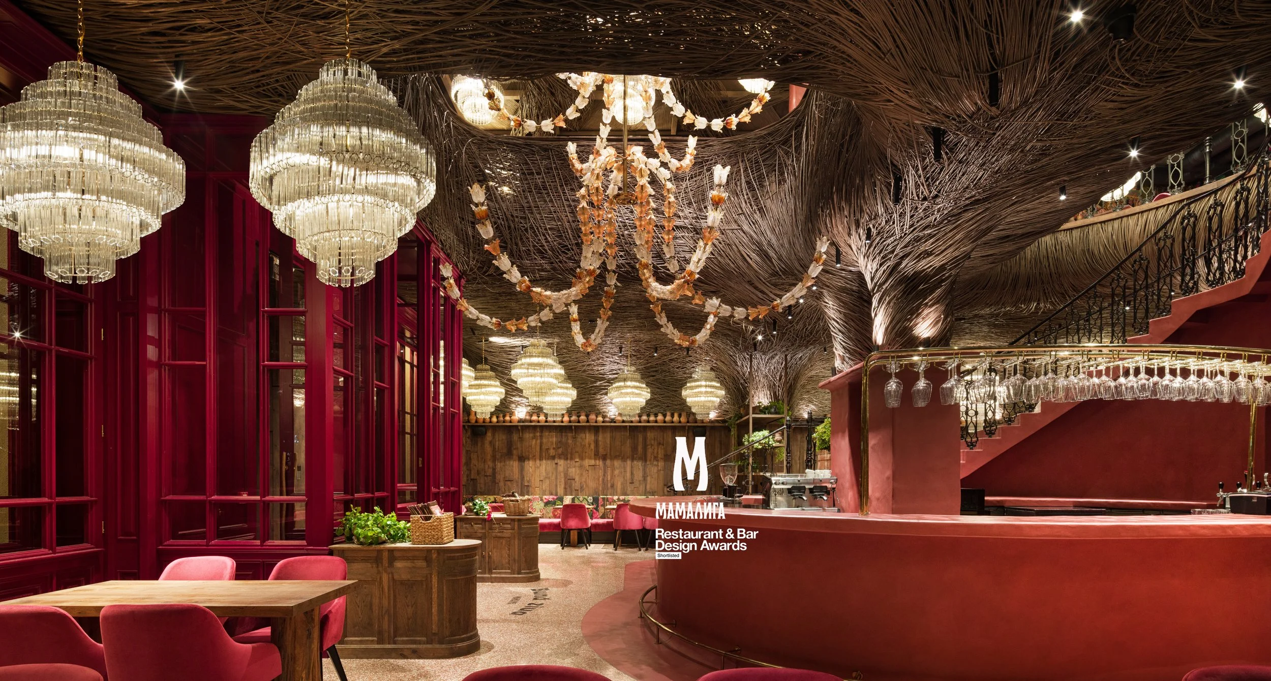
These colors increase heart rate and stimulate appetite. Fast food chains use them extensively — think McDonald's golden arches. But in fine dining, we use warm tones more subtly: terracotta accents, amber lighting, copper details.
Earth Tones: Brown, Beige, Cream
These create comfort and suggest quality ingredients. We used rich wood tones in Mamaliga to evoke traditional Bessarabian warmth.
Colors That Suppress Appetite
Blue
The rarest color in natural foods, blue can actually decrease appetite. We avoid it in dining areas but may use it in bar zones where the focus is drinks, not food.
Gray
Can feel cold and industrial. When we use it (as in Agatha), we balance with warm materials like wood and leather.
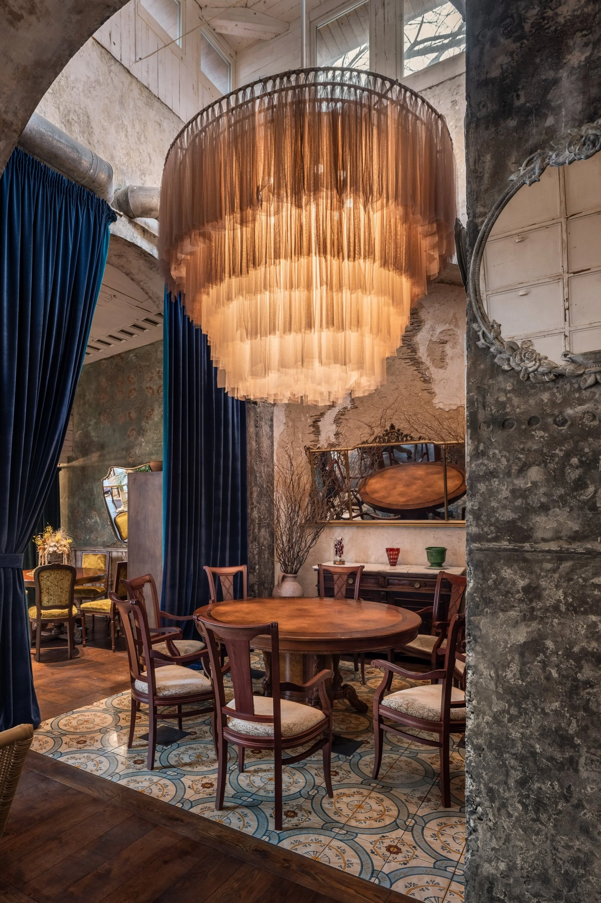
Our Color Philosophy
At Belenko Design, we don't follow trends blindly. We consider:
- The cuisine (Mediterranean? Asian? Local?)
- The target demographic
- The desired turnover rate
- Natural light conditions
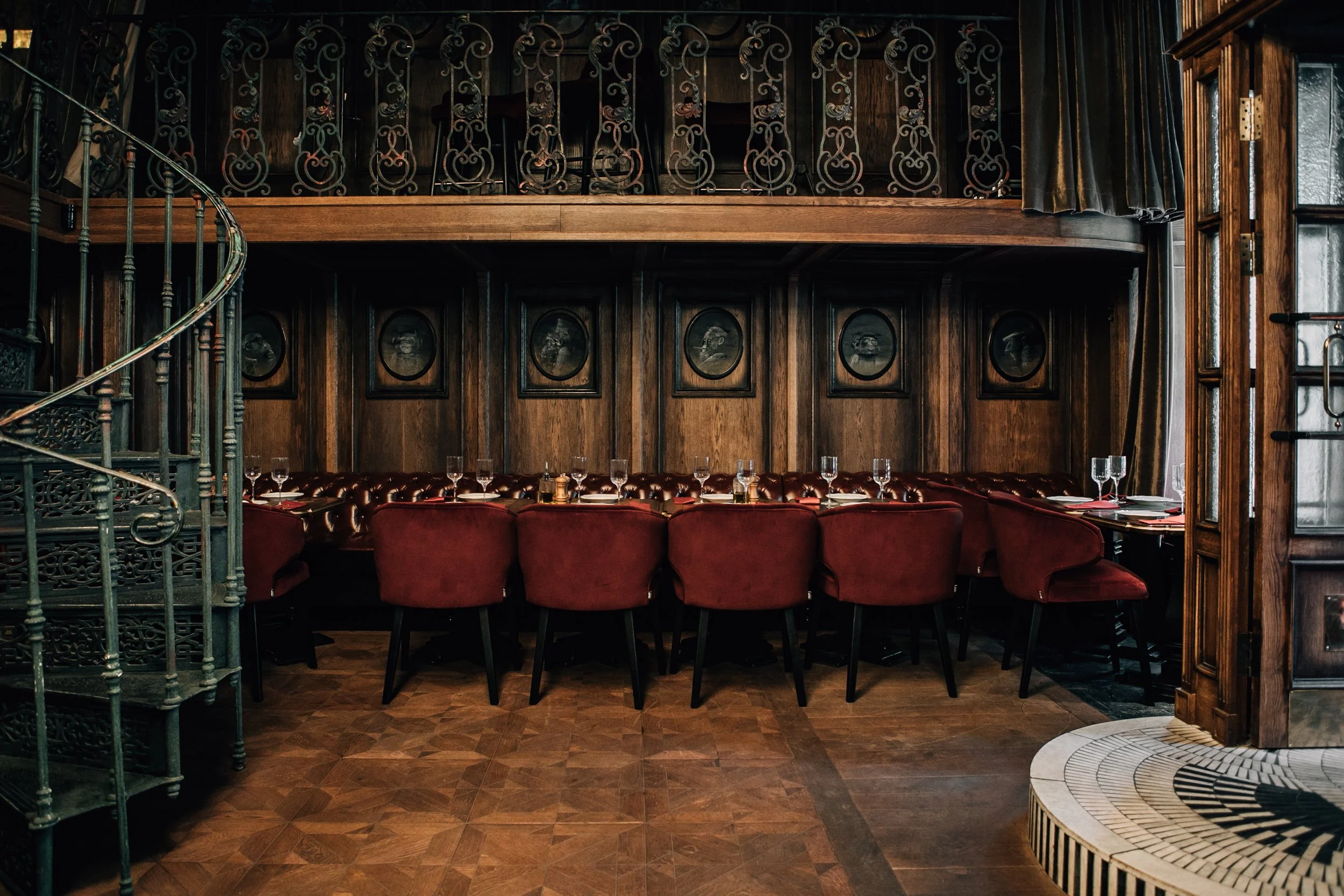
In Babo Gardens, we embraced greens and botanical elements to reinforce the garden-to-table concept. In 12 Monkeys, deep reds and golds created a speakeasy atmosphere.
The best color palette tells your restaurant's story before a single word is spoken.
Ready to transform your space?
Let's discuss your restaurant, bar, or hospitality project.
Get in Touch